
9 Proposal:successes and failures Mid-Century Minimal Elegance in Villa Crespo, Buenos Aires
This Villa Crespo apartment proposal blends high-end minimalism, Mid-Century Modern elegance, and contemporary organic forms. The design focuses on clean architectural lines, sculptural furniture, and premium materials to create a sophisticated, serene, and visually balanced living environment.
The color palette combines warm neutrals such as ivory, beige, and cream with rich accents of forest green, burgundy, and mauve, adding depth and character. Texture plays a central role through the use of matte plaster walls, bouclé upholstery, polished stone surfaces, chrome details, and light oak flooring that enhance the sense of contemporary luxury.
Curved, organic furniture shapes soften the architecture, while statement lighting and large-scale abstract artwork function as sculptural focal points. The result is a refined, inviting, and thoughtfully curated home that balances comfort, elegance, and artistic expression.
Now that we have reviewed each proposal individually, it is time to analyze them from a broader perspective, evaluating both their successes and failures. Each concept offers a different interpretation of the client's lifestyle, aesthetic preferences and functional needs, resulting in unique spatial experiences and design identities. Beyond visual appeal, this comparative analysis examines the performance of each proposal in aspects such as composition, material selection, chromatic balance, spatial fluidity, furniture, lighting strategy and general coherence of the project. Understanding what works correctly and what aspects could be improved allows us to identify which of the alternatives best meets the objectives set. During this process we accompany the client in making decisions, highlighting the advantages and limitations of each proposal. By comparing them together, the client was able to recognize which atmosphere felt most authentic, comfortable, and representative of their personality. The ultimate goal was not simply to choose the most attractive design, but to determine which one achieved the best balance between functionality, aesthetics, comfort and emotional connection. This evaluation process was essential so that the client could confidently select their favorite proposal and move forward with a clear and well-defined design direction.
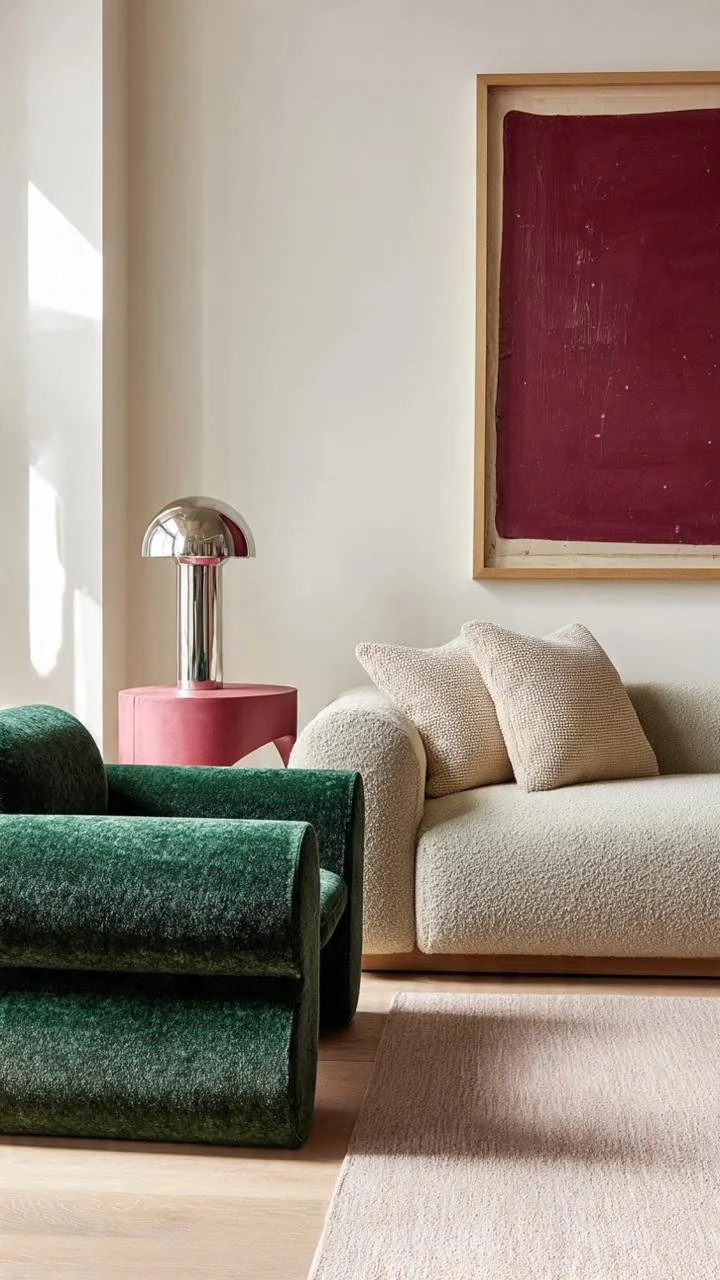
Highlights an open living area featuring a large neutral sectional sofa and an eye-catching, wavy green accent chair. A tall, polished chrome floor lamp stands elegantly beside a striking crimson abstract artwork, while a sculptural mauve side table introduces a playful, geometric block form into the layout.
This is the case where a perfect silver is applied to the lamp, it does not compete with the rest, seeking prominence, it provides identity to the whole.
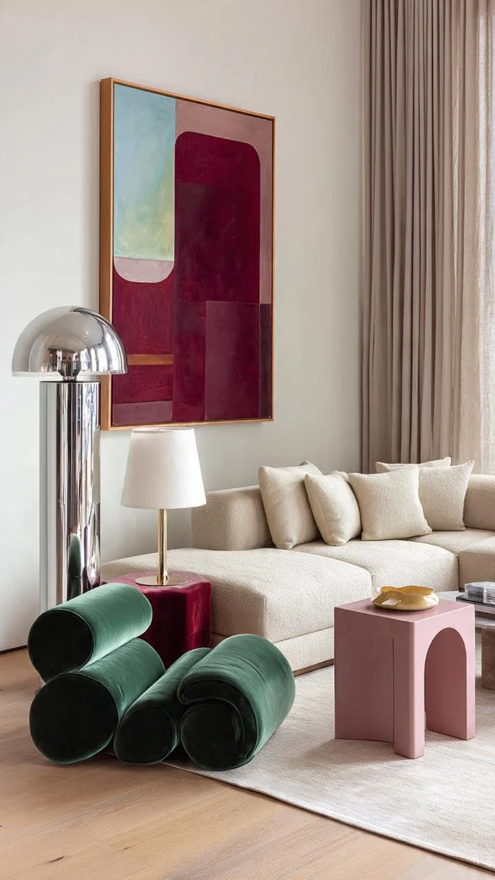
Could you discover what is left over in this environment and what is misused? What is resting in this environment? The correct answer is the auxiliary lamp placed on a velvet pouf. The floor lamp is the protagonist, remember not to mix gold and silver where there are other colors in the set because doing so is making the mistake of breaking the harmony.
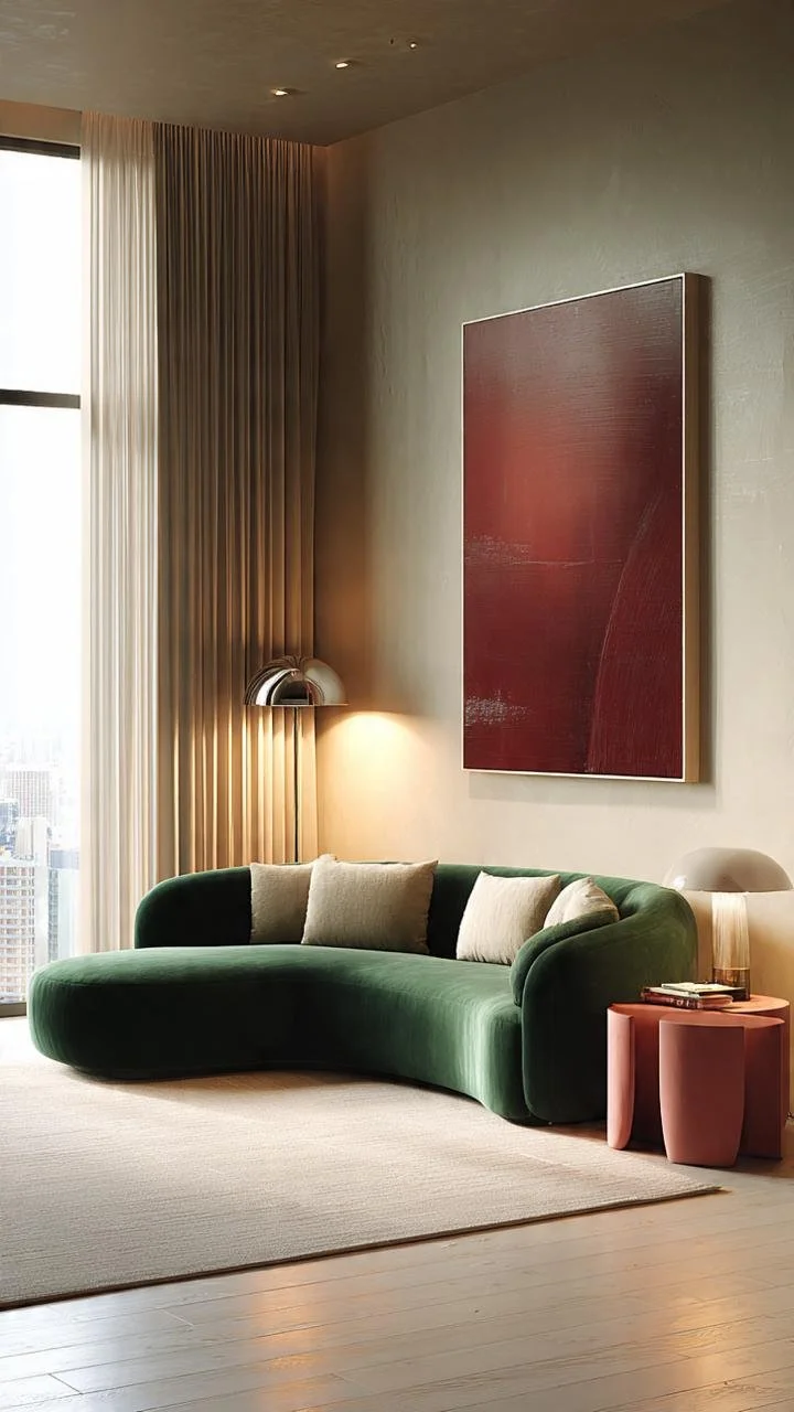
In small environments where the armchair faces the wall with the TV, nesting tables can be used at the end or in the center, with the idea of providing versatility, comfort and, above all, greater space.
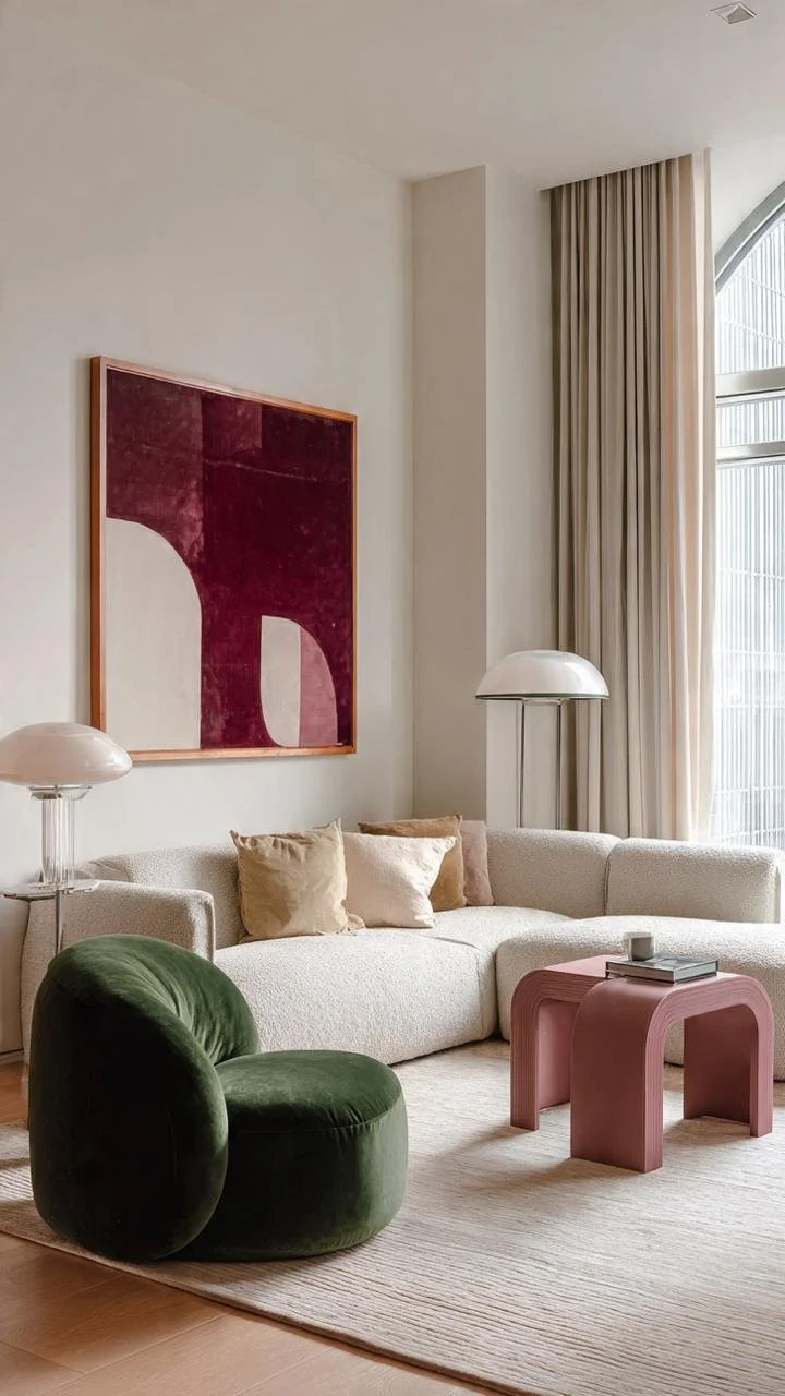
What elements compete with each other in this environment?
The correct answer is lamps. Because? Because they are located at a very short distance from each other and, in addition, they have a very similar design language. As a result, both try to capture visual attention at the same time, generating unnecessary competition within the composition.
The solution would be to move the auxiliary lamp away and relocate it on a console or secondary piece of furniture to give it its own visual space. Another alternative is to replace it with a different design model, with simpler lines, a lighter morphology and a less dominant presence.
In interior design, when two pieces with similar characteristics are too close, neither can really stand out. It is preferable that there is a clear hierarchy, where one piece takes center stage and the others act as support elements, thus creating a more balanced, elegant and harmonious environment.
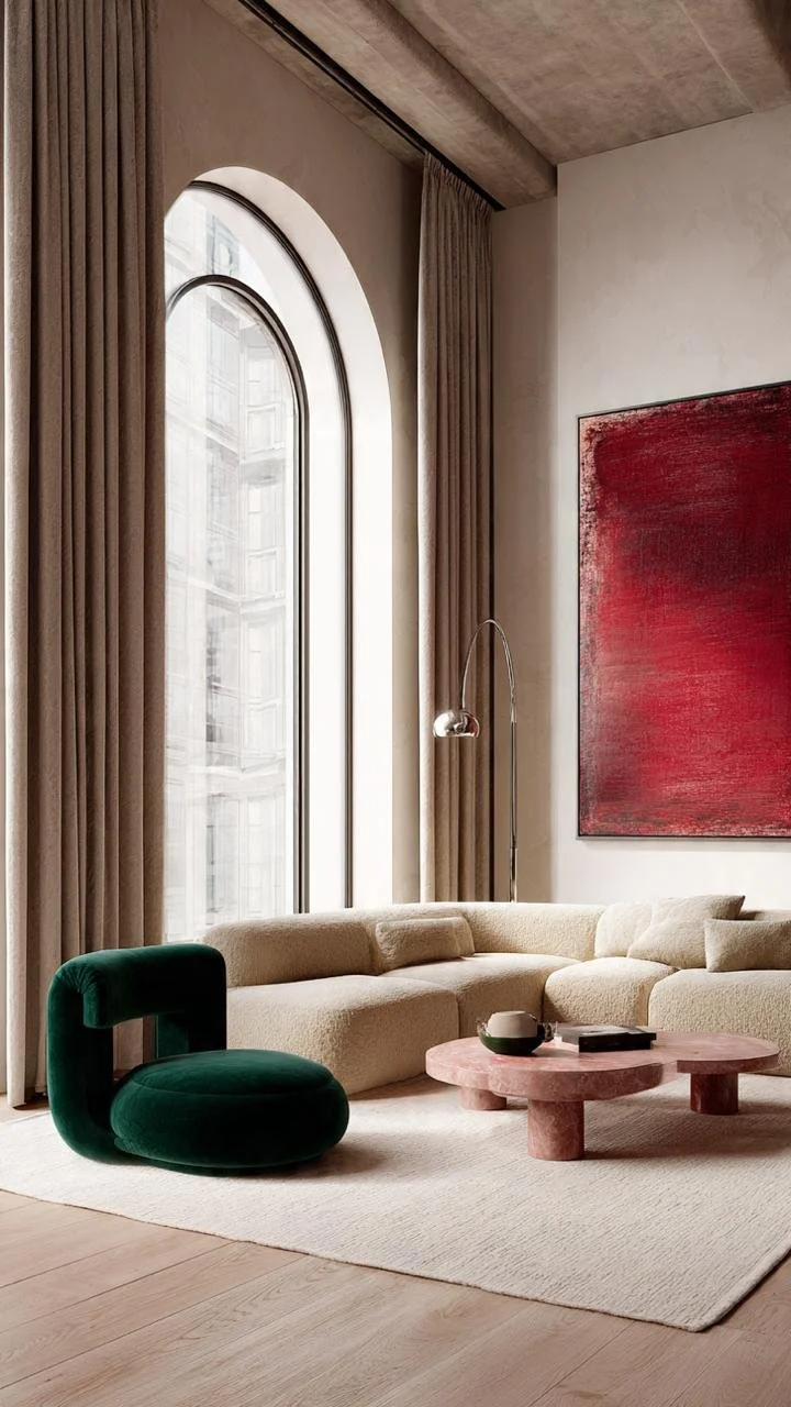
In environments that are from 3.50 meters high or more, always try to use XL paintings on the walls of at least 2 x2 so that you lower the scale a little, and add to a harmonious design.
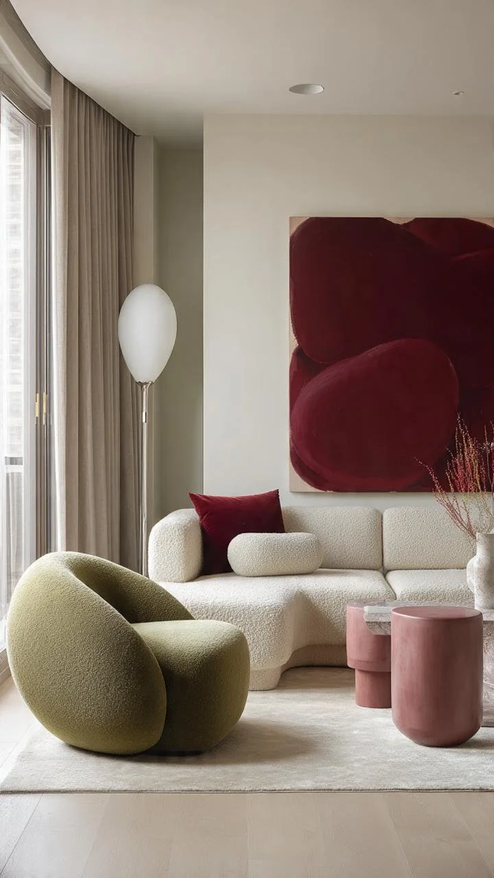
To hit the nail on the head for this style, look for no more than 3 colors that clash, in this case it is the painting, the coffee table and the cushion and the individual armchair, against the three-seat armchair, the curtains, and the rug, but no less important fact: the walls are in the same color palette and the floor is almost similar as well, therefore it absorbs any striking color.
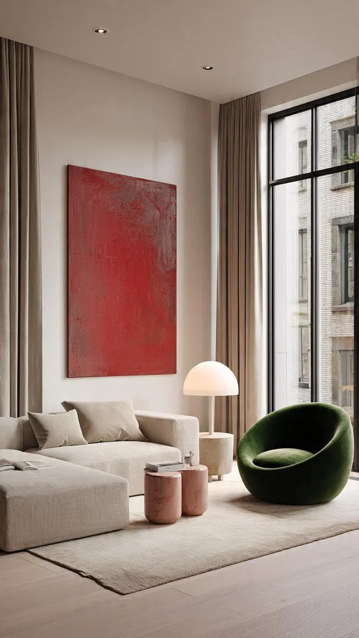
Looking for avant-garde objects is always a key to success, the floor lamp has the function of an auxiliary table
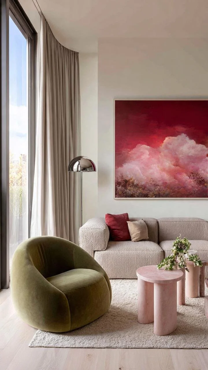
In compositions like these where you already have several ranges of colors, avoid using gold and silver together. The painting chosen for this design does not add any subtraction, imagine the same environment but with the painting in the previous photo!! there if you raise the level.
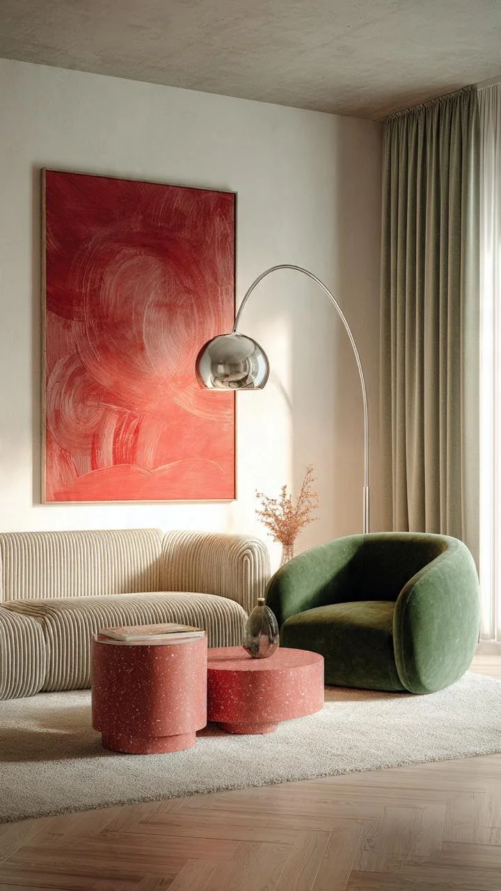
In this environment, what do you think is the star piece? Don't tell me the lamp because of course not, the star piece is the nesting tables because they are built with a material created in Venice in the 15th century that for several years has been a trend today applied to any surface.