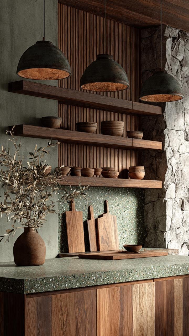
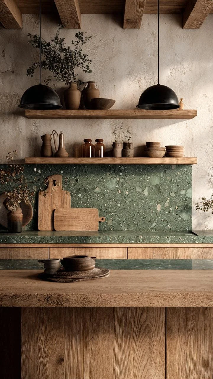
The Visual Trick: The "One Star" Principle
The secret to using terrazzo without overwhelming your kitchen is the "One Star" Principle. Terrazzo is inherently loud, complex, and dynamic due to its multi-colored chips. To prevent sensory overload, you must choose between a Macro-Pattern (Big Chips) or a Micro-Pattern (Small Chips), and then pair it with flat, matte cabinet colors that pull directly from the terrazzo's base or flecks.
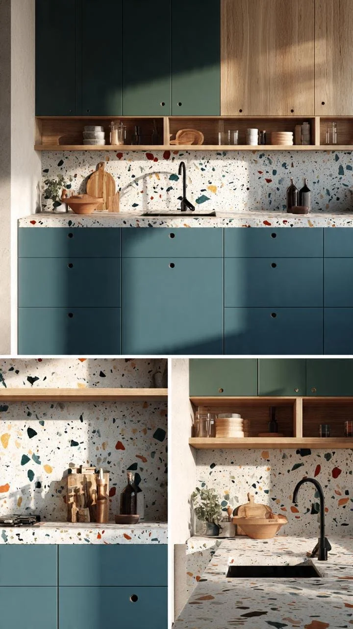
If the terrazzo has large, colorful chunks (like in Photo 4), the cabinets must be entirely plain, handle-less, and matte to serve as the supporting backdrop. If the terrazzo is more uniform (like in Photo 13), you can introduce dual-tone cabinets (wood + color) because the stone acts more like a solid neutral texture rather than a chaotic pattern.
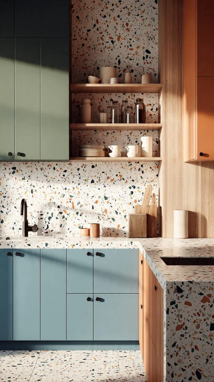
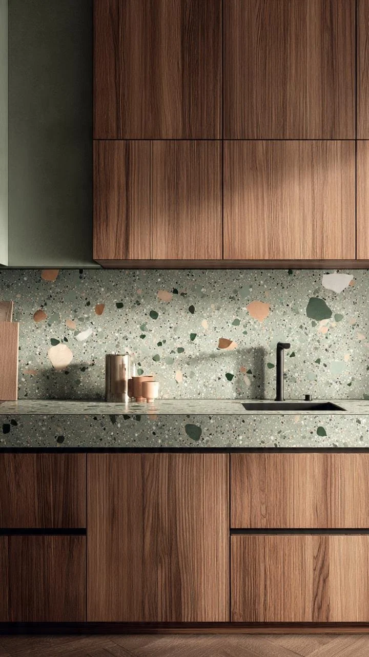
This kitchen uses a split-cabinet strategy. The lower cabinets are a soft, cool sage green that anchors the space, while the top features warm wooden shelving. This breakdown allows the medium-chip terrazzo backsplash to breathe without making the narrow space feel cluttered.
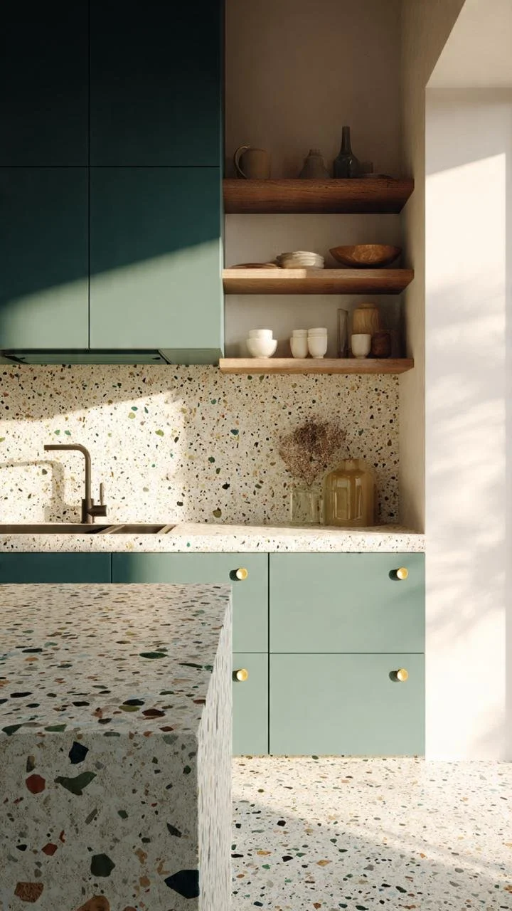
By pairing a mint-green lower cabinet with a crisp white-base terrazzo island, this setup maximizes natural light. The solid, matte finish of the cabinets absorbs excess reflection, preventing the busy terrazzo pattern from looking chaotic under direct sunlight.
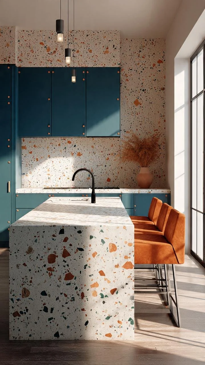
The design relies on ultra-clean lines with zero visible handles on the sage green cabinets. This lack of hardware acts as a "visual pause," ensuring that the intricate terrazzo pattern remains the only detailed element in the entire composition.
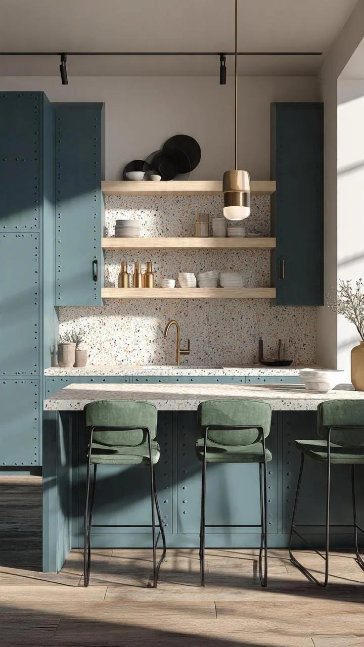
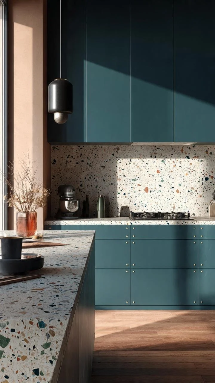
This is the boldest execution. The island features an aggressive, large-scale terrazzo with giant chunks. The trick to balancing it is the background: dark teal blue cabinets that are entirely solid, matte, and dark, which instantly absorb the visual noise of the massive stone pieces.
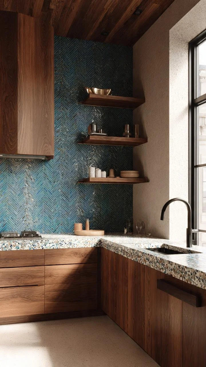
The heavy blue-gray cabinets occupy a massive vertical footprint. To prevent the kitchen from feeling suffocating, the terrazzo island uses a bright white base with tiny micro-chips, creating a much-needed zone of brightness in the center.
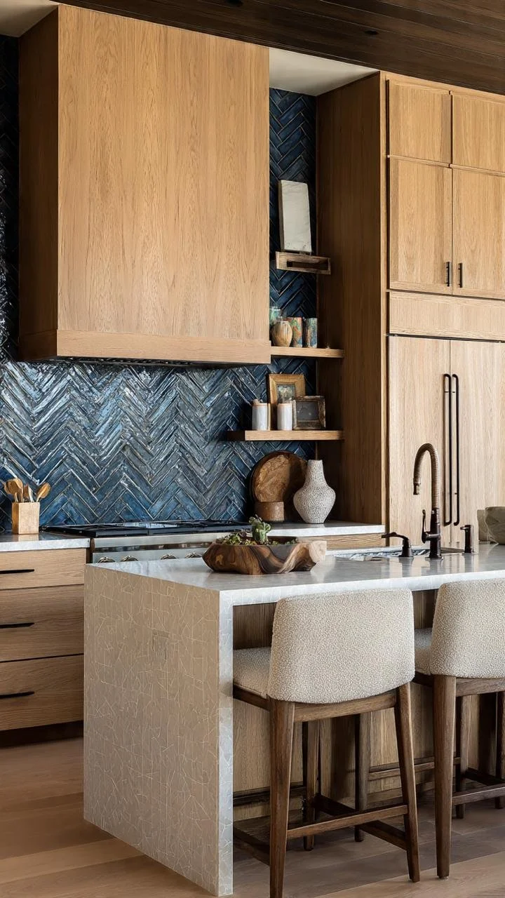
Because the main wall features a highly textured, vibrant blue tile, the terrazzo countertop is kept extremely quiet with subtle gray specks. The terrazzo purposefully submits to the rich, grain-heavy wood and blue tiles so they don't fight for attention.
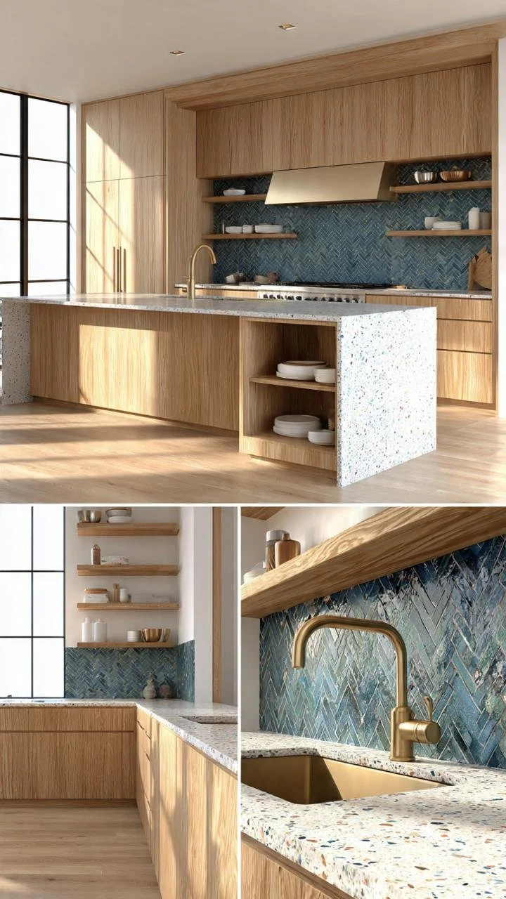
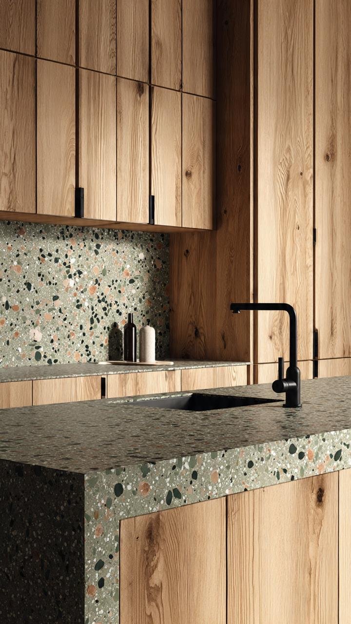
This layout utilizes a warmer-toned terrazzo with sand and ochre undertones. It is paired with sleek, light oak cabinets. By keeping the color palette strictly analogous (colors next to each other on the color wheel), the stone pattern seamlessly blends into the wood grain.
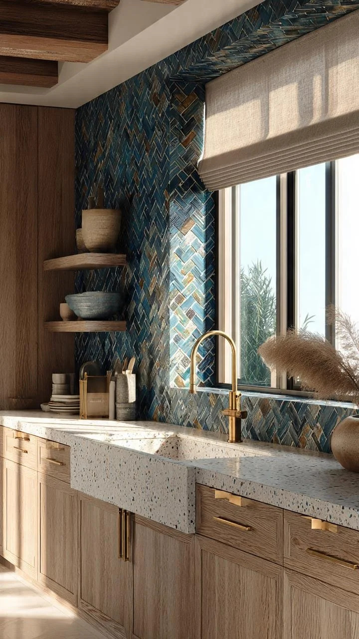
The island features a warm terrazzo waterfall edge that drops to the floor. The surrounding wood cabinets are kept in a matching neutral tone, ensuring the eye is drawn straight to the beautiful stone pattern without distraction from competing colors.
This kitchen features reeded wooden lower cabinets and a textured blue wall. Because there are already strong vertical lines and wall textures, the terrazzo counter uses an incredibly quiet, sand-like micro-speck pattern to avoid visual overload.
A masterclass in modern color blocking. Deep, rich forest green cabinets frame a bright white terrazzo with sparse, crisp black and gray chips. The sharp contrast between the solid dark block and the bright patterned stone stops the eye from getting overwhelmed.
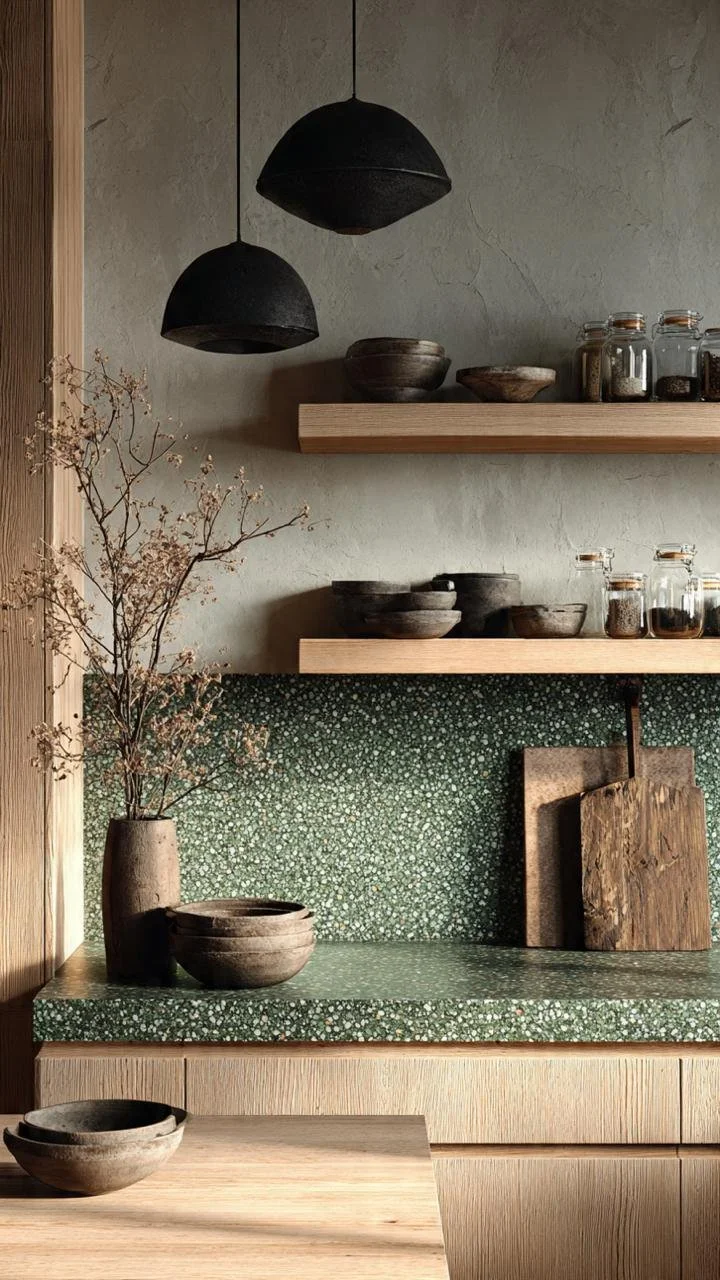
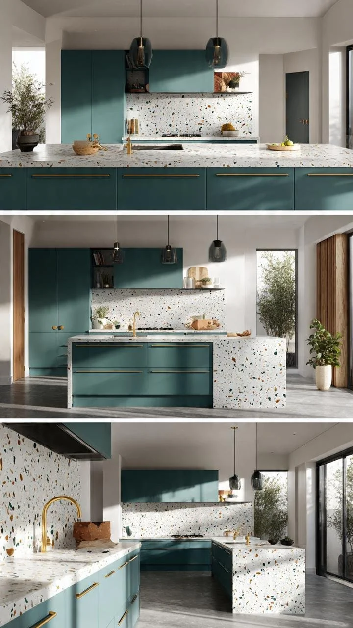
This design combines dark teal lowers, open wood uppers, and an active terrazzo. The trick to making this three-part mix work is geometry: the terrazzo pattern is tightly bound between the strict horizontal lines of the countertops and shelves, boxing the chaos into a structured grid.
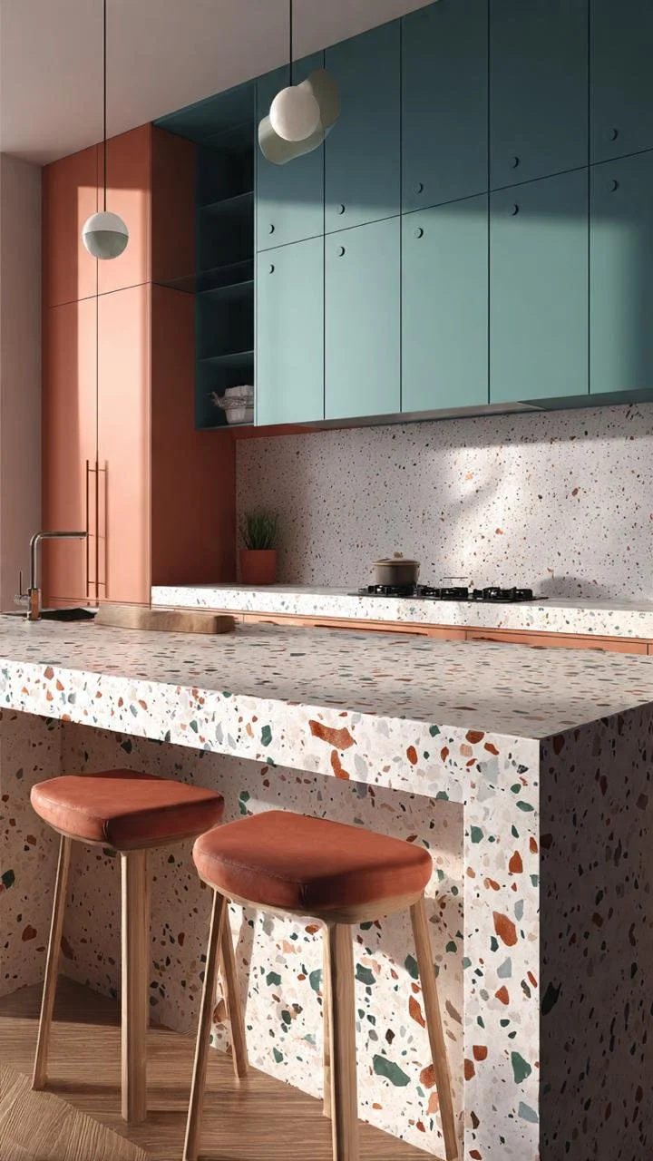
This layout pairs warm terracotta/rust stools with a matching terrazzo base that contains rust-colored chips. The upper cabinets are a contrasting dusty teal. The trick is matching your furniture accent color exactly to one of the minor colors inside the terrazzo stone.
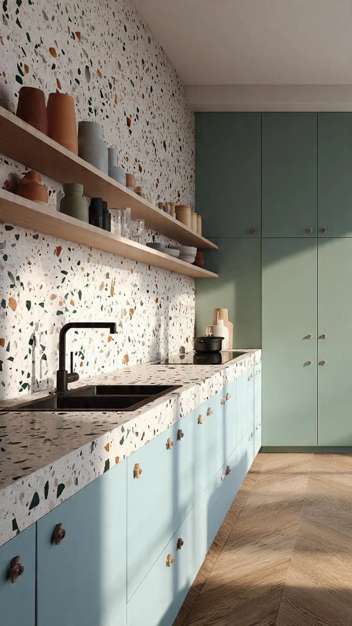
Featuring full-height mint green pantry cabinets on one side and a long terrazzo counter on the other. Because the mint green is so soft and desaturated, it acts as a neutral canvas, allowing the terrazzo backsplash to climb higher up the wall without shrinking the room.
This perspective shows a continuous terrazzo waterfall island anchoring an open space. The soft sage cabinetry is kept identical across both the lower levels and upper frames, creating a unified color border that "brackets" and tames the busy terrazzo pattern.