
The Three-Color Rule Kitchen Designers Never Admit They're Following: Why This "Too Bold" Combo Actually Works Every Single Time
Most kitchen advice tells you to pick one accent color and keep everything else neutral. This collection throws that rule out entirely — and proves that three saturated colors, used with discipline, can work better than one safe one. Every kitchen here follows the exact same formula: brick-red upper cabinets, deep plum or aubergine lower cabinets, and a soft sage-green tiled backsplash tying the two together in the middle. Warm wood countertops and brass hardware keep the palette from feeling cold, while bold graphic floor tiles — circles, diamonds, patchwork patterns in red, blue, cream, and charcoal — add a fourth layer of pattern without breaking the color story. It looks maximalist and fearless, but it's actually built on a strict, repeatable system: warm color on top, cool-dark color on the bottom, a muted color in between, and one graphic floor pattern pulling everything together. This gallery walks through all nine kitchens using the formula, plus a tip for trying a version of it without repainting your entire kitchen.
The Tip + The Solution
The tip: Most people avoid bold color in the kitchen because they're afraid of picking one wrong shade and throwing off the whole room — so they default to white or gray and lose all personality.
The solution: Split your cabinetry into two zones instead of one: a bold, warm color on the upper cabinets and a deep, cool-dark color on the lower cabinets, separated visually by a muted backsplash tile in a soft, in-between tone like sage green. This "sandwich" method means no single color has to carry the whole room, and the muted middle layer keeps the two bold colors from clashing. If you're not ready to commit to paint, start with the floor — a graphic patterned tile is the easiest way to test how much boldness the room can handle before you touch the cabinets.
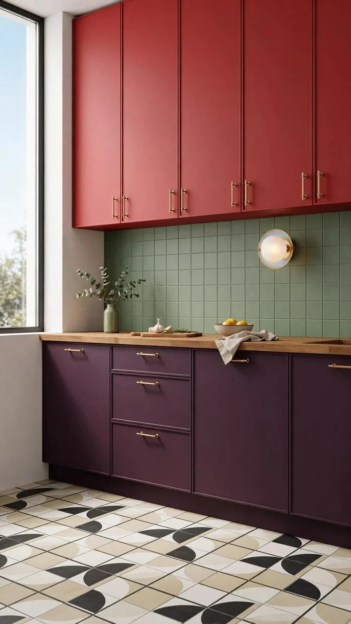
Brick-red upper cabinets sit above a sage-green tiled backsplash and deep plum lower cabinets, with a black-and-white geometric floor tile grounding the whole composition.
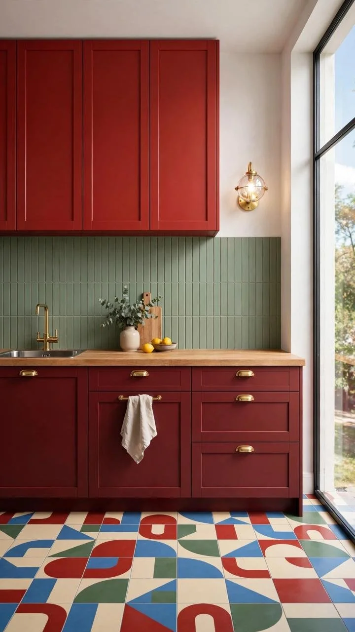
A tighter view highlights the warm wood countertop bridging the red cabinets above and the plum cabinetry below, with a colorful patchwork tile floor visible underfoot.
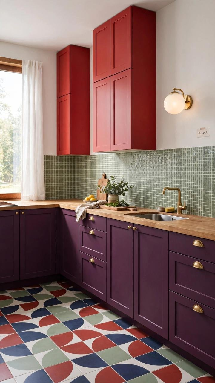
Tall red cabinets rise into the corner here, with sage tile continuing along the backsplash and a mix of red, blue, and cream circular floor tiles adding graphic energy.
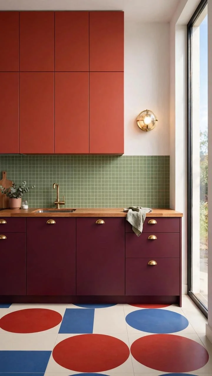
A closer crop on the floor shows oversized red and blue polka-dot tiles taking center stage, with the same red-and-plum cabinet formula continuing above.
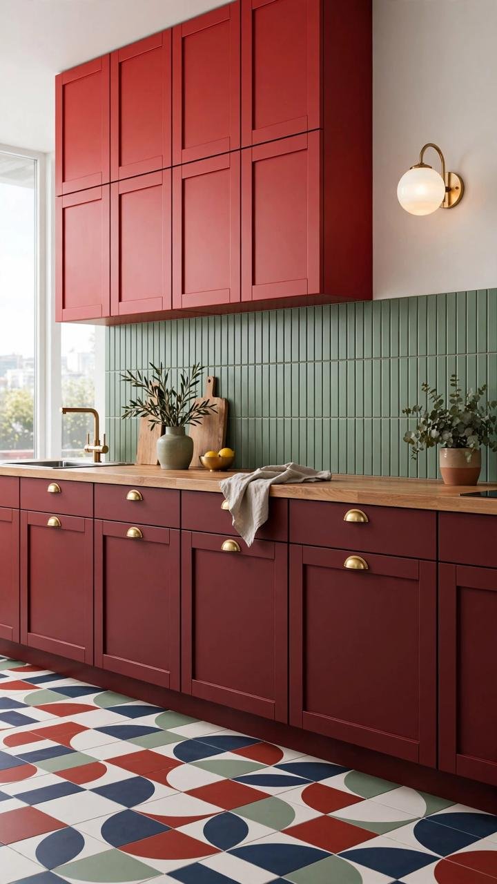
A long run of red upper cabinets stretches across the kitchen, with brass hardware and a wall sconce adding warmth against the deep plum base cabinets below.
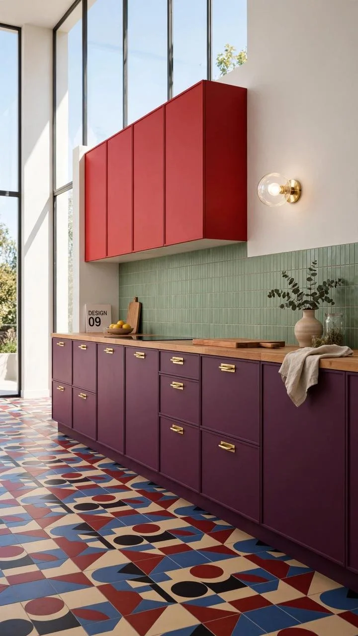
A full L-shaped kitchen view shows the entire color formula in one frame — red, sage, plum, and a graphic tile floor — proving the system scales to a larger footprint.
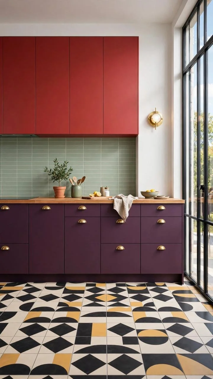
A more angular, diamond-patterned floor tile in gold, black, and cream adds a slightly different graphic note while keeping the same red-and-plum cabinet palette.
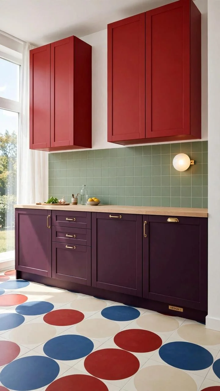
Oversized red and blue circles cover the floor in this version, creating a bold, almost playful contrast against the more restrained cabinetry above.
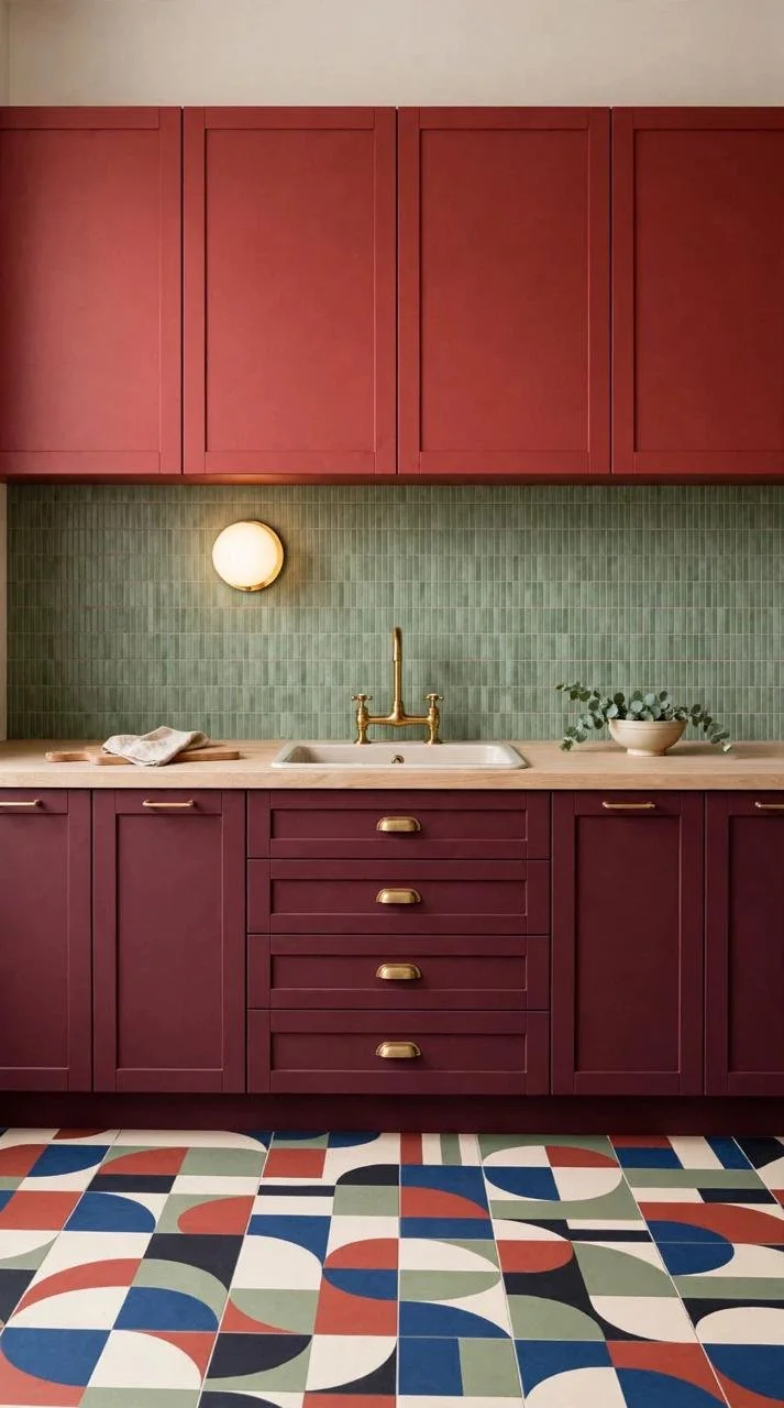
A straight-on view of the full kitchen wall captures the complete formula clearly: red uppers, sage backsplash, plum lowers, and a softly patterned tile floor tying it all together.